Monday 6 February 2017

Youth Fix Post Two

30th January- 6th February

Looking back to my children’s wear and artist inspiration this week, I started by transferring my mark making drawings onto Photoshop to make digital brushes as well as drawing more graphical shapes on Illustrator to combine the two drawing styles for unique prints.

Fig. 22
Kids Wear Context Research


As the collection is aimed for Spring/Summer 18, I found colour palettes and inspiration that I started to experiment with and add to on Adobe Illustrator and Photoshop.

Fig. 23

Colour experiments


I want my print collection to be a versatile one that can work as a unisex children’s wear collection where colours are able to suit a particular gender with a change of colour. For my final collection, the prints will include a wide range of colours in order to fit appropriately for a unisex children’s market.

After much digital experimentation with combining the mark making and graphical shapes, patterns started to merge and print collections were produced. As I have been working with subtle colours throughout this unit, using these vivid colours for this particular brief was a fun change. Working entirely digitally is also something I haven’t usually took on in my practice, however it was an efficient and quick way of working. Working with digital techniques seems more appropriate for a quirky yet professional children’s wear range as I was able to capture not only hand drawn naïve elements but also bolder, dynamic elements. The combination of the two worked really effectively to develop an exciting collection of gender neutral playful prints.

Fig. 24
Digital Designs


After representing my print design through my children’s wear illustrations, I got more of an idea how certain prints could work on garment shapes. As the motifs within my prints are unfamiliar shapes and marks, I could thoroughly play around with the scale of the prints in relation to a garment. The visualisations also portrayed how the prints worked together as a collection and how versatile they were individually as each one worked well on many different garment shapes.

Fig. 25


Throughout this particular brief, I have learnt that sometimes less is more. Simple marks and shapes, when combined, can produce intriguing and lively designs. I have also found that I work best when I am challenging myself to work with different techniques and in this case busy colour palettes. Colour is something I will be thinking about for Unit X as I seem to have responded well to energetic colours within prints. 

Fig. 26
Collection

Monday 30 January 2017

Youth Fix Post One

23rd Jan- 30th Jan

For my last quick project of the practice unit I have decided to do another live brief which will be entered into Bradford’s Textile Society Competition for the ‘Printed fashion Textiles design on any base fabric’ category.

As it is nearing the end of the Practice Unit, I want to try something different, whether that be a different context, printing technique or software. Therefore, my ideas have narrowed down to a Unisex Children’s wear colourful, vibrant digital print collection for Spring/Summer 18 with the age range of 0 -12 yrs. Therefore, I can practice a new context as well as experiment with bold colours and the use of Adobe Illustrator to refresh my skills.

This week has been mainly focused on gathering research and primary drawings. As children’s wear is a new context I have approached, research into it has been my main priority. WGSN provides new trends for all ages and I came across a trend forecast called ‘Youth Tonic’ that stood out to me. The initial image is what has inspired the rest of my research, with its fun, childlike doodles and colours seen in figure 19.

Fig. 19


With fun, bright bold qualities and naïve themes as a starting point I then turned to the upper scale high street brands such as ‘Monkey Mccoy and ‘Melula’ to explore the kind of styles and trends going on today. Bright colour was a reoccurring theme as well as dynamic, energetic shapes and prints and therefore I feel colour and shape will be an important part within my collection. Artists, Tom Abbiss Smith, Artelier Bingo, Ashley Goldburg and fashion designer Daniel Palillo inspired me to take a mark making combined with simple graphic shapes approach to drawing which has also allowed me to work both with hand mark making as well as digital drawing techniques to gather drawings I can combine to create unique patterns.

Fig. 20


Mark Making is an easy and efficient way to achieve quirky and original marks. It is a technique that always works and is something I enjoy. Using household objects and black acrylic paint, I started to create exciting marks and shapes inspired by the child like doodles seen on the WGSN page. The childlike naïve theme has been communicated through these, yet they can still work appropriately on a printed children’s wear garment.

Fig. 21

Mark making


The marks are simple yet effective however, my plan is to combine these mark making prints with more graphical shapes made on illustrator so I can start to add bright bold colour which is essential for my children’s wear collection. 

Monday 23 January 2017

Botanical Untouched Post Two

17th Jan- 23rd Jan

As I have learnt from my last project that preparation for the Print room is key, a lot of my time this week has been spent preparing and mono printing. Figure 12 shows my prepared repeat patterns done on Photoshop as guides for my painting on to screen as to minimalise mistakes and make the most of the time I have in the Print room.

Fig. 12

Repeat Guides


Colour is a really important to get right and therefore, I have spent a lot of time mixing colours, recording the outcomes and printing some colour tests onto the fabrics I am hoping to use. This colour experimentation was really valuable as I learnt a lot about reactive dyes and what fabrics they work on the best which informed my printing.

Although I have not applied the technique of mono printing within my time at university a lot, I was surprised at how much I enjoyed doing it. There is a lot of room for mistakes when painting on the screen as you can just wash away the colour and paint over it. Although it was time consuming, the outcomes are really effective and convey a quality on the fabric similar to that of watercolour and have a certain authenticity to them. One sample shows the autumn/winter collection, whereas the two other samples show a more spring/summer collection.

In order to support the mono prints within a collection, sublimation prints were made with my other repeat patters on Photoshop. This also meant that the prints were made up from my original drawings which still enabled the watercolour qualities to transfer onto the fabrics. A back up technique such as digitally printing or sublimation printing is something I always think about. When my Autumn/Winter mono print design was pushed through the screen to transfer to fabric, residue from a previous printer was left on the screen, blocking parts of the mesh. Therefore areas of my print could not reach onto the fabric. However, due to having the digital back up plan I was able to quickly print digital and sublimation samples to back up and support the Autumn/Winter collection.

Fig. 13
Mono Print mistake


  Visualisations of the two different collections were made in order to understand how each individual print could work as a bedding set, whether it would work for the main duvet, the reverse of the duvet, the pillow cases or the bed sheet as the same motifs and repeat patterns can be used throughout a single bedding set seen in figure 14.

Fig. 14
Bed sets


As I need to move on to my final project of the unit I do not have time to thoroughly think more into other bedroom furniture. However, making up visualisations can give me a rough idea on how my prints could work at different scales for lamps shades, chairs, cushions and wallpaper. This is something I can really start to think about in Unit X which could also inform the making up of a product for the degree show.

Fig. 15
Examples of furnishings


Although I have produced a small collection for bedding, there is a lot more mileage I can attain from my practice throughout this Unit and apply it to future projects in Unit X such as screen printing techniques, context research and painting skills. The thought of painting was a nerve racking one until it worked well in this Unit. Therefore, hopefully I can start to explore painting with different mediums more thoroughly in the next units/projects to create more print collections.


Fig. 16


Monday 16 January 2017

Botanical Untouched Post One

9th-16th January

To start my second self-initiated brief off I have been looking at photographs I took whilst on a trip to Amsterdam. Whilst there I visited the Keukenhof tulip fields where there were various types of flowers and plants to capture. (fig. 9)

Fig. 9

Amsterdam Keukenhof 


Using watercolour, I have been painting from the colour, shapes and textures I can see within the photographs. Initially my painting started off a bit rough and messy as watercolour is not something I have practiced much, however I have persevered and started to create my own style and collection of paintings. The paintings have a unique quality to them as they are still not fully controlled and perfect, yet have gained a certain character and delicacy as seen in fig.10.

Fig. 10
Watercolour painting


As my context is furnishing fabrics, I have been looking for inspiration from liberty London’s (see fig.11) print collection for furnishing fabrics and have found many that relate to the theme of florals similar to my work. Comparable to the Liberty London collections, my water colour paintings are very feminine which is ideal for a bedroom wear context as my designs will attract a female audience with the idea to dress both individual and shared bedrooms in many different households. This could also mean designing for bedrooms for couples as females are most likely to take over the interior aspect of their bedrooms, adding softer more dainty furnishings.

Fig. 10

Liberty London furnishing fabrics


As my drawings consist of various smaller motifs, I am planning to scan and photocopy them in order to manipulate scale and create some interesting compositions. These compositions will be the basis of my prints, which I will be taking to Photoshop to create repeat patterns. I also expect some of the repeat patterns to be a guide for my mono prints. Although I have not practiced mono printing techniques recently, I believe it is the right approach to allow the kind of characteristics I have built within my watercolour drawings and paintings to communicate through on to fabric. I expect the mono printing technique will be time consuming and so I plan to produce different prints using my Photoshop developments in order to bulk up my collection when digitally printed. 

Monday 19 December 2016

St Anthony's High School Placement

10th November 2016

After a few exchanged emails about ideas for a print workshop I plan to undertake whilst at my Placement, today I met Becky Mayall, the textiles teacher whom I will be working with. I also met the Year 10 textiles class I will be working with by observing a presentation being shown to the class by a lady who works for Ikea. I noticed the students lost concentration as the woman spoke to them at the front of the class. She didn’t use her PowerPoint to guide her presentation which resulted in a few stop/start moments. This made me consider some of the ways in which I could engage the students when I do my presentation/lesson.

 After the Ikea presentation had finished, myself and Becky had some time to talk about our plans for my print workshop. We talked about what I had learnt from the presentation I had just witnessed and spoke about the little overlooked things such as knowing when the right time is to pass round my samples which is key for a successful presentation. I also spoke about how I wanted my presentation to be a little less overwhelming and more of a conversational Q&A session followed by a print workshop. I suggested we put tables together to make a bigger table in order to all sit round where I can show my own work and samples easily as well as allowing me to come across as a less authoritative figure where students could feel comfortable in asking me questions. We also spoke about a PowerPoint presentation flowing in the background to keep me on track which Becky agreed to take control of whilst I would be sat round the table myself.

Next time I see Becky I will have a PowerPoint presentation of my learning experiences on my course at university, and the journey from drawings to prints; something Becky feels the students need to see in order to boost their motivation as they seem to be getting bored with drawing in their project. I 
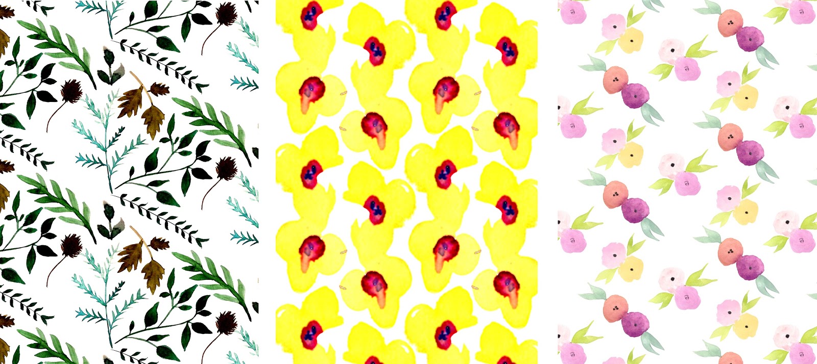
will also research into some ideas for the GCSE project the students are undertaking, ‘Natural Forms’ theme as the inspiration for my Print Workshop as well as a lesson plan to familiarise Becky with my ideas. This way I can easily receive feedback from her if there is anything she would like me to do differently.

24th November 2016

After showing Becky my Textiles print work today, we agreed to not use the Power Point Presentation as I am more set on the idea of a more conversational lesson, where I can sit round a table with the students going through the work I have produced. A Power point running in the background runs the risk of students losing concentration on what I’m saying and passing round. This will also hopefully create a more relaxed atmosphere and encourage the students to speak honestly about going to college and their thoughts on University.
Today I also brought in my work for Becky to see as well as the project I am working on at the moment which involved the paper prints using an easy printing technique and paper fans. As this idea is a cheap, easy and a fun way to print as well as the fact it can be easily integrated into their ‘Natural Forms’ project, we agreed this is the technique I will use for my Print workshop next week.

30th November 2016

After observing and helping the class for four week today was my own constructed lesson. My workshop was really successful in the way that the students gained inspiration from my work as well as learnt a new technique which they can now develop on. The idea to have a more conversational lesson was the right choice and it worked really well as the students were interested and got involved with asking me questions about themes, concepts and university as a whole. This half of the lesson flowed really nicely and I enjoyed speaking to the students and hearing their ideas, questions, concerns and worries to which I hopefully helped and advised correctly. 

The second half of my lesson was a bit more hectic as there was limited space and therefore a bit more time than planned was spent on creating more spaces for the students to work. Other students didn’t get involved due to the limited space and although Becky and I were encouraging them to have a go I believe they most likely felt intimidated by the chaos of it all. The students who did get involved started producing some really good prints, accomplishing texture and colour. Some students even improvised with other objects such as string and cardboard to create their own original style of prints. 

Some of the things I learnt was to make sure you have enough space. I took Becky’s word for there being enough space around the table we were working on where students could take turns, however due to the excitement of it all, there was no real structure or order to make sure every student had a go as some students were enjoying it so much they took over a certain space for the entire time of the workshop. 

Although it may seem obvious, another thing I learnt was that not everyone will enjoy what you enjoy and if this was a permanent/weekly workshop I would need back up plans and activities as well as a variety of resources in order to interest every student.

Time also becomes a learning curve in the way that there are some things you can’t plan for and you need to make sure you have given yourself enough time in case something does go wrong. For example, if there was another lesson in the room I did my work shop in straight after my allotted time, the room would not have been tidied as I didn’t plan any time for the students to finish up and reflect on their work or time to tidy up. In the end myself, Becky and a few helpful students tidied the mess. 

Over all, I feel I have introduced a new technique and way of ‘drawing’ that will hopefully boost motivation and show the students a more hands on approach to being creative. Printing is something I didn’t understand or use in my work at high school and I hope that this workshop has provided a little insight into something a bit different to what they are used to doing. I have also gained new confidence in myself that I can organise and produce a successful workshop on my own and I enjoy it at the same time. This is definitely a direction I would like to pursue in the future.

Print Workshop


*Due to health and safety procedures taken at St Anthony’s High School I cannot post photographs and images showing the students faces. 

Friday 16 December 2016

Botanical Shrub Post Three


5th Dec-16th Dec

These passed two weeks, I have focused on finishing off my first self-initiated project ‘Botanical Shrub’ as I need to move on in order to complete two more briefs. Although I want to perfect this brief, I had a slow start and a few setbacks which has cost me time towards the end. Therefore, I have spent time refining prints, adding other colour and techniques to create a print collection for beach wear.

Researching into the context of beach wear has enabled me to choose the right fabrics on which to print onto. Looking into brands and companies such as 'Accessorize' and other high street beach wear brands, I decided to use linen and polyester fabrics rather than the more up market silk, cotton and chiffon fabrics. The types of beach wear products I have in mind are beach shorts/pants, kaftans, sarongs and wraps which I have communicated through visualisations in fig.7 to help me understand how certain prints would sit as a product.

Fig. 7 

Beach Wear Visualisations


In order to allow for more variation within the collection, more line drawing was done and therefore more motif based designs were created. However, due to lack of A3 sized screens in the print workshop, all my screen designs were put onto one large A2 screen which was difficult to navigate and print motifs with. The screen was too large and as each motif sat on its own it meant I had to wash and wait for the screen to dry each time I used it which became quite insufficient. With time to finish this collection decreasing, I have decided to abandon the motifs and carry on with layering the textured screens and introducing the technique of devore to add another subtle yet effective quality to the samples. The see through burnt out areas within the prints, achieved with the devore technique, has proved to be a more appropriate way of producing another texture within my samples than puff binder or flock as it has a delicate value, suitable for a beach wear context. Expanding the colour palette with tropical yellows and oranges has also worked well in communicating tropical themes as well as a summer beach wear context and over all a sophisticated collection.


Fig. 8

Final Collection

Yet I do believe changes could have been made through out this project in order to create some variation within my prints. Whether this could have been motifs or different textures coming through or a bit of embellishment. 

Friday 2 December 2016

Botanical Shrub Post Two

28th Nov- 2nd December 2016


Working from the layers within my paper prints, I created four screen designs, each with a different texture. As most of my work has been textured/surface design based I wanted to add other botanical motifs. Due to the chaotic nature of my previous paper prints, I thought simple line drawings of exotic plants would be the best way to achieve a body of motifs. 

Fig. 4 
“Leaves, Ile St. Louis” (1950) by Ellesworth Kelly 


Exploring the line drawing work of Ellesworth Kelly, I started drawing from exotic plants I found and photographed to create simple motifs for a different screen design to juxtapose with the other textured screen designs as seen in fig. 5.

Fig. 5

Screen Designs

Working with pink, green and black reactive dyes I started working in the print room with no preparation or plan as to composing my prints. As I have not practiced screen printing for around 7 months, my day screen printing became more experimental, layering screens to build the textures and getting myself back into the routine of screen printing as a whole. This slow start added with no preparation meant my production of prints was inefficient, however not completely wasted as I learnt preparation was key for next time and got accustomed to working safely in the print room again. 


Fig. 6


My print samples as seen in fig.6 portrays the exploration of different techniques which I wanted to use due to my absence in the print room for so long. For example, puff binder was used, however it is not an appropriate technique to use when considering beach wear. On the other hand, maybe the use of devore could be a lighter, more suitable technique to use for a beach wear context. The colour in the print samples are also not honourable to the exotic, tropical jungle theme for my beach wear project and therefore, I will spend time mixing colours to get them right next week in order to create more refined screen print samples. 

Sunday 27 November 2016

Botanical Shrub Post One

14th November – 27th November

After researching into traditional printing techniques to practice, I came across a paper printing technique I thought would communicate my botanical shrub theme appropriately. Folding thick cartridge paper in different shapes and sizes I created paper fans. After painting acrylic paint onto a sheet of plastic, I used these fans to continuously stamp through the paint to create textured leaf-like motifs. Once I was happy with the composition and lay out of them, I layered different qualities of paper whether it be cartridge, acetate, newsprint or tracing paper over the top and pulled the print off the plastic onto the paper. Greens and pinks were the main colours I was experimenting with initially printing on to black and white paper, however I realised the colours seemed dull and appeared washed out on the black paper as you can see in figure 1. 


Fig.1
Initial Paper Prints


After realising I had to take a different approach to working on black backgrounds, I painted my own black backgrounds for the prints with acrylic paint and ink. After printing on top of these painted backgrounds, I could see the different effect the backgrounds had on the colours of the prints. When working on a black acrylic painted background, the colours of the prints seemed to liven up, on the other hand when working on a black ink painted background, the colours of the prints would darken and developed a shadowed texture. Acrylic painted black backgrounds worked a lot better as the colour from the prints sat on top of the black background colour rather than absorbed it. This livened the colours and consequently brightened the prints.


Fig.2
Ink                         Acrylic


The paper prints started to become similar to one another and so I painted textured backgrounds to work onto and started to explore the diverse outcomes, which were different each time. Figure 3 shows the layering of textures and prints on top of one another which produced more refined, in depth prints. These layered prints communicate the wild botanical theme more appropriately as a certain chaotic jungle feel is conveyed. The colours also seemed more striking and energetic which is something I wanted to achieve in relation to a beach wear range/context.


Fig.3

However, whilst using acrylic paint, I don’t believe I am able to create the right colours for my prints. Therefore, I will take the idea of this paper printing technique and develop it with layering screen printing techniques to build on designs as well as start to refine my colour palette.  

Youth Fix Post Two

30 th January- 6 th February Looking back to my children’s wear and artist inspiration this week, I started by transferring my mark m...